
A story of two lost robots searching for a way home
Battery Buddies was created for the Chillenium Game Jam, the largest student-run game jam in the world, and I had the honor of being the lead programmer and designer for the game. Our team consisted of four members, and we worked together to create an innovative gameplay mechanic that won the best in programming award, beating over 200 other participants.
The game's level and mechanical design received endorsements from James Portnow, the writer of Extra Credits. We ideated and prototyped twelve level designs, which we later reduced to four to provide a five-minute play experience. We focused on ensuring that the gameplay was fun and engaging for the players by testing and tweaking the mechanics to make the battery-throwing experience as seamless as possible.
We then designed and implemented four levels for the game jam version, focusing on ensuring that the judges would be able to experience a full playthrough within the allotted five to seven minutes. The levels were designed to test the players on new concepts, with each level naturally leading the player to make an assumption using what they had learned so far. The game's focus was on puzzle mechanics rather than skill-based platforming, and we kept the jam levels to a single screen with legible instructions to guide the players.
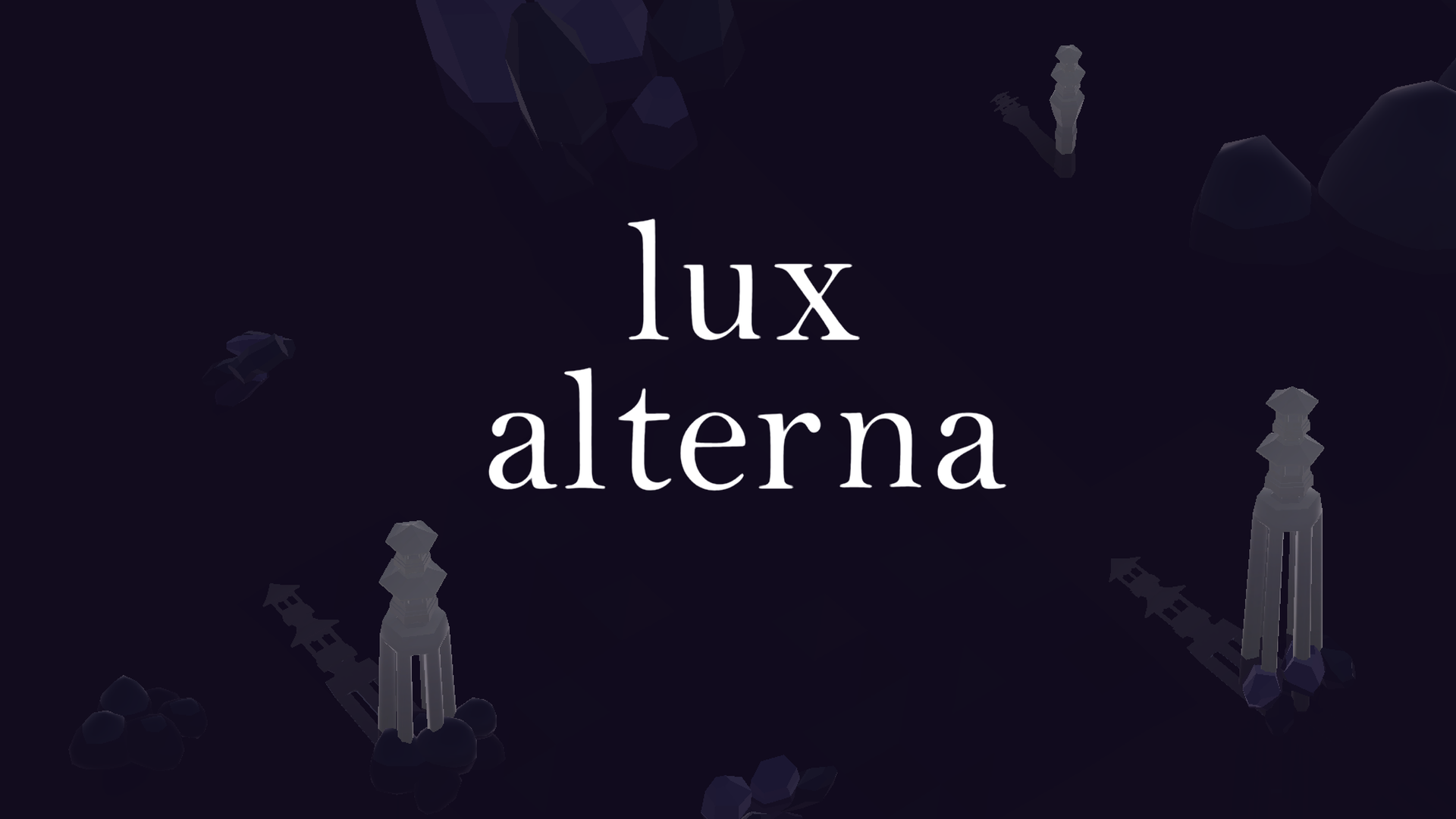
A puzzle game about returning color to a lost world
I worked on the game Lux Alterna as a programmer and designer. The game was made in a week for the One Minute Jam, a game jam about making a game that can be played in one minute.
I created a new puzzle mechanic about changing colors and being chased by monsters of different colors in a turn-based puzzle game. To make sure that the puzzles were sufficiently difficult but not outright impossible or frustrating, I created paper prototypes of possible levels. The levels were initially much harder than I thought, but I was able to rework them into levels that were challenging but could be solved with some effort.
After designing the levels, I implemented the mechanics and made the game, using the paper prototypes as a guide. I spent a lot of time polishing the game, adding a procedural wave animation for the tiles to make it feel like the game was floating on water, and incorporating several see-through planes that animated to give the illusion of lapping water.
Finally, I created exit animations for the levels to provide a satisfying player experience. Despite the tight deadline, I was able to complete the game in just one week for the One Minute Jam, demonstrating my efficiency and adaptability in game development.
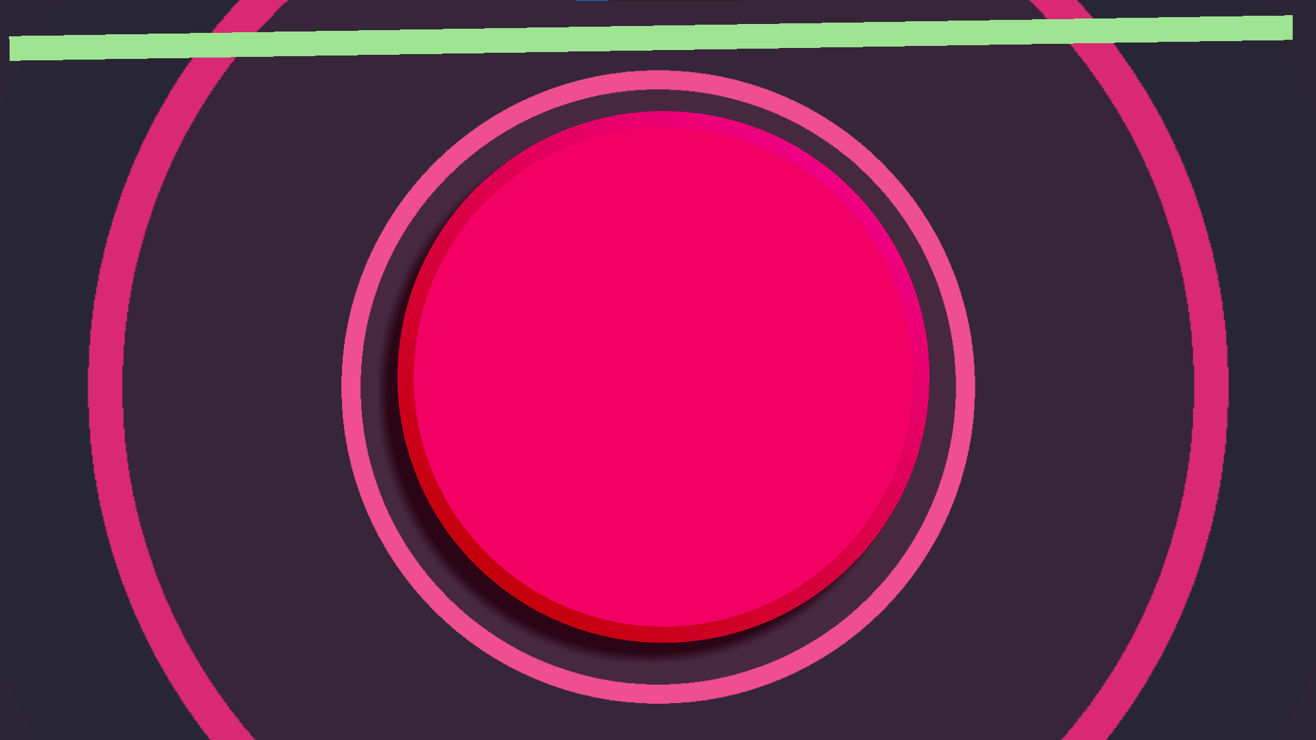
How good can one button feel?
I created the game One More press as an exercise in making UI fun to interact with, the game is all about pressing one button, but I use several ways it a captivating and enjoyable experience for the player. It was initially made for the juice jam, a game jam with over 160 submitted games where it won tenth in theme, and 17th in juice.
There are some surface level ways that I make the button fun to press, as the player presses the button music fades in, a ring expands behind the button, and a bar fills at the top of the screen. After the player gets passed the 4th color change an additional woo! sound effect is added when the player fully fills the bar. Once the bar fully fills the screen behind the button changes color. There are however some additional subtle things that the player may not initially notice. The button expands slightly when pressed, the screen shake gets progressively more intense, and the progress bar also shakes. The progress bar also fills exponentially, so it starts off increasing a very small amount but as it gets more full it fills by a larger amount. And rather than fill immediately the player has to continuously click once the bar is full. If the player stops pressing the button the bar drains in a similar fashion. At first draining really fast but then draining slower. The game is still played today and has many comments talking about how addictive the game is.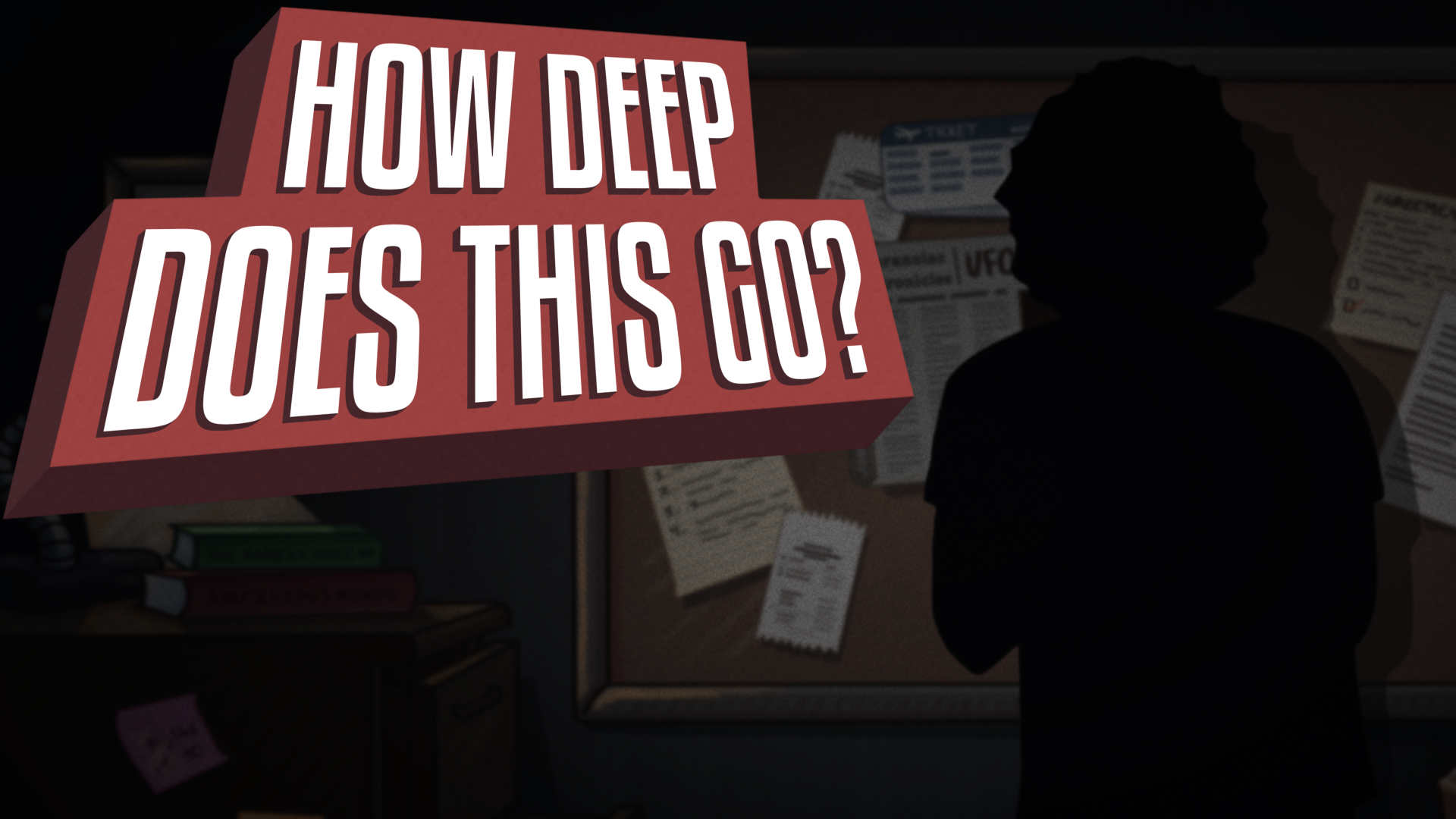
A procedural systems powered conspiracy board puzzle game
Designed Made and published in less than a mon th, this title features a campaign and an endless varient for each level.
In Planet Rover the player takes control of Earth's newest little explorer, adventuring across Earth, Mars, extra-terrestrial planets, and even a black hole! In the single player campaign, you will need to avoid the aliens as you collect artifacts, and batteries to keep up your energy. But watch out, each command you send takes a few seconds for the rover to receive, so you’ll have to plan ahead! Do you have what it takes to get all the way through?With this games in addition to putting out the product, the goal was to develop experience between team members, with art, design, sound, and programming. It was a success in that regard and in many others. With the quick turnaround time design had to be both simple and elegant. So I created a simple but relatively unique and understandable movement system by taking classic movement formulas for mobile and changing the dimensionality of it by putting it on a sphere. Since there wasn't much time for level design it was important to create a system that could be tweaked to create new and distinct levels easily by managing just a few parameters. In the end I found that the best balance was by giving the player two competing interests, these vary from level to level but to allow for replayability they took the form of having specific locations on the planet be desirable to arrive at but a movement system that was imprecise enough that the player would often make some small mistakes,leading to frantic corrections, this impreciseness comes from a diagetic game element with a delay between an input being sent and recieved by the rover
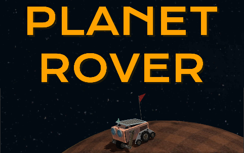
A journey to the stars for a little robot who's just trying to keep going
Designed Made and published in less than a month, this title features a campaign and an endless varient for each level.
In Planet Rover the player takes control of Earth's newest little explorer, adventuring across Earth, Mars, extra-terrestrial planets, and even a black hole! In the single player campaign, you will need to avoid the aliens as you collect artifacts, and batteries to keep up your energy. But watch out, each command you send takes a few seconds for the rover to receive, so you’ll have to plan ahead! Do you have what it takes to get all the way through?With this games in addition to putting out the product, the goal was to develop experience between team members, with art, design, sound, and programming. It was a success in that regard and in many others. With the quick turnaround time design had to be both simple and elegant. So I created a simple but relatively unique and understandable movement system by taking classic movement formulas for mobile and changing the dimensionality of it by putting it on a sphere. Since there wasn't much time for level design it was important to create a system that could be tweaked to create new and distinct levels easily by managing just a few parameters. In the end I found that the best balance was by giving the player two competing interests, these vary from level to level but to allow for replayability they took the form of having specific locations on the planet be desirable to arrive at but a movement system that was imprecise enough that the player would often make some small mistakes,leading to frantic corrections, this impreciseness comes from a diagetic game element with a delay between an input being sent and recieved by the rover
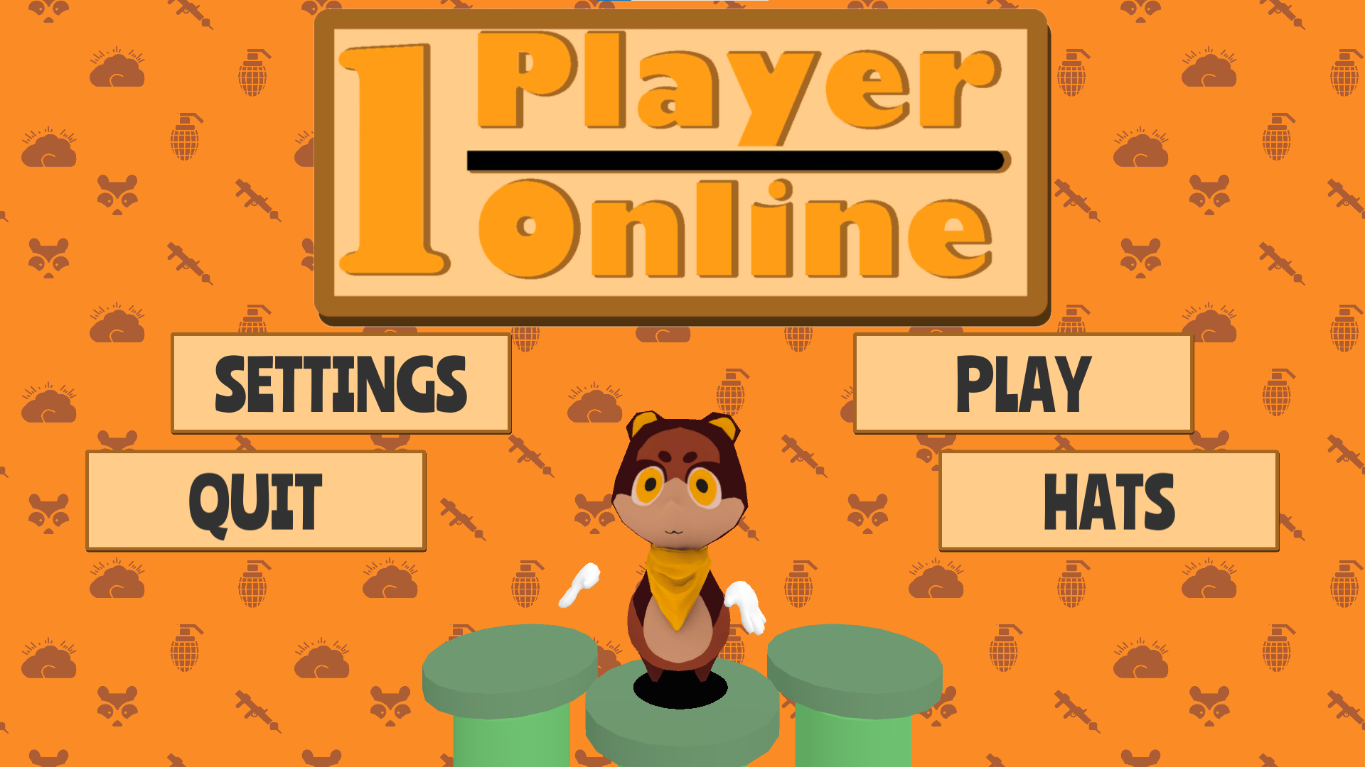
A battle royale where you are your own worst enemy
For One Player Online, I did the mechanical and level design of a battle royale where you play against clones of yourself. This was an interesting design challenge due to the nature of battle royales, I wanted to preserve the feeling of moving around a map while having to keep track of other players without compromising on the game featuring just the player as a hazard.
What I ended up doing was making a time limit where the player had to find and destroy three random targets. However the player only has a grenade launcher for their weapon, since the grenade launcher is relatively imprecise it means that the player will probably miss several shots before hitting the target. Additionally, the targets being in different places encourages the player to wander around the map.
Both of these aspects come into play once the player finishes destroying the targets. They get re-spawned, and have to go and find a new set of targets, avoid being killed by the previous version of themselves, and also kill the previous version. This cycle keeps repeating until many clones of the player are running around and wreaking havoc.
I designed the level in such a way as to funnel players into moving around over a hill, managing the movement so that there is a balance of cover and visibly distinct areas that allow the player to orientate themselves. Spawn management was an interesting challenge for both the player spawn positions and the target spawn positions, as both influence how the player moves. I also designed the main menu UI and did all of the animation for the game
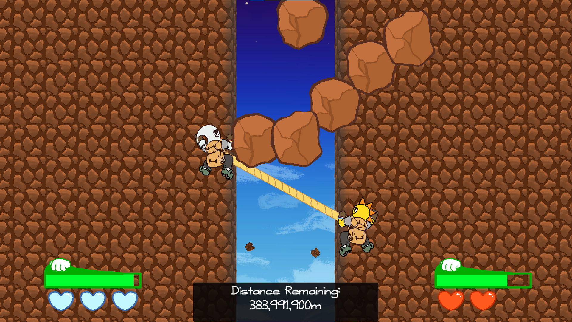
The sun and moon have to work together to climb back to the cosmos
For the Game Makers Toolkit Game jam I made stellar scalars with a team of four people, I handled some of the mechanical design and split ideation with my team's other designer Michael Frean.
Initially, we wanted to make a physics-based puzzle game like ice climbers, but we found that the most fun part was swinging your little character around while the other character had more traditional movement. We wanted to focus on mastering that mechanic so we instead chose to make a game where the rope was a rigid line, and instead of being a puzzle, it's an arcade-style high score chaser, where the fun comes from mastering the movement mechanics.
Now the players control both characters, who can be moved up down left and right as long as they are climbing on a wall, but climbing makes them tired and they must periodically take breaks. The level of tiredness is indicated with a stamina bar as well as by how much the character is sweating. To take a break, the character disconnects from the wall and swings freely, however, this puts additional strain on the character still attached to the wall.
Additionally, we designed obstacles that periodically fall from the sky, forcing the players to move. The screen is split into two climbable walls with a cliffside between them. I added this to force the player to disconnect from the wall for reasons other than recovering stamina and give them a little bit more to keep track of.

For the Texas A&M semester Game Jam competition, I created the game First Person Tetris. It's a game that combines the play loop of Tetris with parkour platformer mechanics. In the game, you must simultaneously play Tetris and keep yourself above a rising layer of lava.
I designed the balance of the game to require a high skill level of balancing the two aspects, as well as handled all of the visuals for the game. I made the game in one semester, and it was my first serious foray into solo development. Throughout the process, I learned a lot about movement and conflicting design, and I had to make accessibility tools for people who were not able to visualize the game in their head.
A unique design challenge I addressed was balancing the player's desire to go up as fast as possible with the fact that in Tetris, when you make a line, that line disappears from the game. So, I made it so you must form a certain number of lines to be able to safely move up past a certain height. If you try and climb without making those lines, you are killed by electricity. Now, the player has to make lines quick enough to outpace the rising lava.
In addition to the Tetris mechanics, the game features movement mechanics to help you traverse the level as you change the landscape of the world. Since the nature of Tetris is that often many sheer vertical faces form with narrow holes, I added a wall jump for escaping deep pits. I also added an edge climb for escaping pits. I'd like to go back and add some input buffering and a wall cling to help with movement.
I also think gameplay could be refined the game by removing the rising lava, at least at the start. This would help focus on getting the player a more solid understanding of the mechanics. Additionally, I aim to add some input buffering and wall cling to enhance the player's experience.
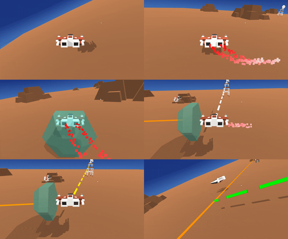
Balance your limited power to make sure you stay in control in this GMTK 2020 game jam entry
In this game control is a limited resource, you can only have so many systems on at once! Although your ship has controls for flying, turning, downloading data from comm towers, and a laser blocking shield you can only afford to power two at once. Control is a limited resource and you'll quickly run out trying to do everything at once.
Made for the GMTK 20202 game jam, the making of constelaltion chaos was all about polish. The goal wasto make a seamless experience in 48 hours with the focus being put on pleasent and readable UI, and readable features that work intuitivle mechanicly. With plenty of experimenting with the Unity Animator I think there was a good amount of success to be found, with the largest exception being that the movement could feel a little oddly weighted. Mechanically I wanted to make something fairly relaxed so easy going music and a fairly lenient open ended level were designed so that the actual game functioned more as a playground to test different interactions.
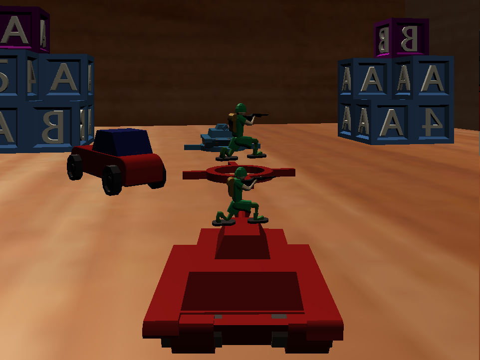
A first foray into 3D development. Play as toy tanks stacking soldiers and slinging bodys
Dank Tanks is a multiplayer game that takes place inside a children's toy-box, where a war rages between red and blue army men. The objective is to launch soldiers at the enemy and destroy their tower. However, to do so, the player must first collect their own soldiers and protect them from being shot by the enemy tower. If a soldier is shot, the entire tower above them collapses, creating an opportunity for underdog comebacks and situation reversals.
To make the game more engaging, we designed the level layout with a balance between players and an engaging flow of combat. We also created a comedic atmosphere with light tones of macabre humor, utilizing the gameplay to strengthen the theme. The toy-box theme was no coincidence either; we wanted the game to have a sort of morbid comedic feel to it, but still have a simple aesthetic since it was our first time working in 3D.
We coordinated a four-person team consisting of a sound designer, artist, game designer, and programmer to create Dank Tanks. Initially, the only mechanic of the game was to throw large groups of soldiers as a sacrifice to fit the "all for one" theme. However, we decided to create a more dynamic experience by designing a secondary loop of avoiding enemy bullets, shooting enemy towers, and spacial control of spawn zones.

A game making compeition in conjunction with the medical industry
A livestreamed 30 day Accelerator meets hackathon, working with a team of professionals and industry veterens to design and create prototype games for the medical space
As a game developer, I had the unique opportunity to work on a groundbreaking project called Mentalis, a browser-based tool for mental health. This was an exciting challenge for me and my team as we were tasked with creating a platform that could help people struggling with mental health issues. We wanted to create a tool that would provide users with a safe and supportive space to explore their emotions and develop positive coping mechanisms. To achieve this, we worked on new and exclusive cutting-edge software called Clutch.
Our team worked tirelessly to produce a working prototype in less than thirty days, which was no small feat. The process was intense and required the active collaboration of a team of three developers. Together, we built tools that allowed non-game developers to create custom scenarios within Mentalis, making it a more inclusive platform. It was truly rewarding to see our hard work pay off when Mentalis was put on display for industry professionals who were quickly taken with the game concept. My skills were of a high enough quality to win me the accolade of best overall programmer among all competing teams.
One of the most exciting aspects of working on Mentalis was being part of a high-intensity filmed environment that was later turned into a documentary which was shown to limited audiences as an illustration on the game making experience and an excisting intersection between games and healthcare. It was a unique experience to see our work captured on camera and presented to a wider audience. The documentary highlighted the importance of addressing mental health issues and showcased how innovative technologies like Mentalis can make a positive impact on people's lives.
Feel free to reach out with any questions or thoughts you mught have